Building a premium tier on an existing free product
Summary
Baselane is a financial platform built for small landlords.
By 2025, leadership was ready to introduce a paid tier that captured value from the users we had served best — multi-property landlords who would happily pay to take more administrative work off their plate.
This was a complex project with several trade-offs in terms of business decisions, product complexity and UX.
My role
As the lead designer for the project, my responsibilities included:
- Upsell UX strategy & design
- Subscription & trial flow design
- Brand identity direction
- Motion design process setup
- New features design & testing
- SaaS essentials (billing, downgrade, reactivation)
Company
Instawork
Collaborators
Business leadership
PMs
PMM
Growth
Engineering
Graphic designer
Motion designer (agency)
Timeline
Q1–Q2 2025 (6 months)
Finding the right value proposition
The journey to Baselane Smart began with a straightforward question: which features should users pay for? The initial instinct was a three-tier model — one free plan and two paid tiers — each stacked with premium capabilities across banking, bookkeeping, and rent collection.
In practice, this created a different problem: too much choice. Research showed that users valued different subsets of features depending on their portfolio size and workflow, making it impossible to draw a clean line between tiers. No single feature set resonated universally, and A/B signal was noisy.
But digging into the qualitative data revealed a consistent thread: every segment placed the highest value on whichever feature saved them the most time. Time — not feature depth — was the real currency. That insight reframed the entire strategy.
Upselling
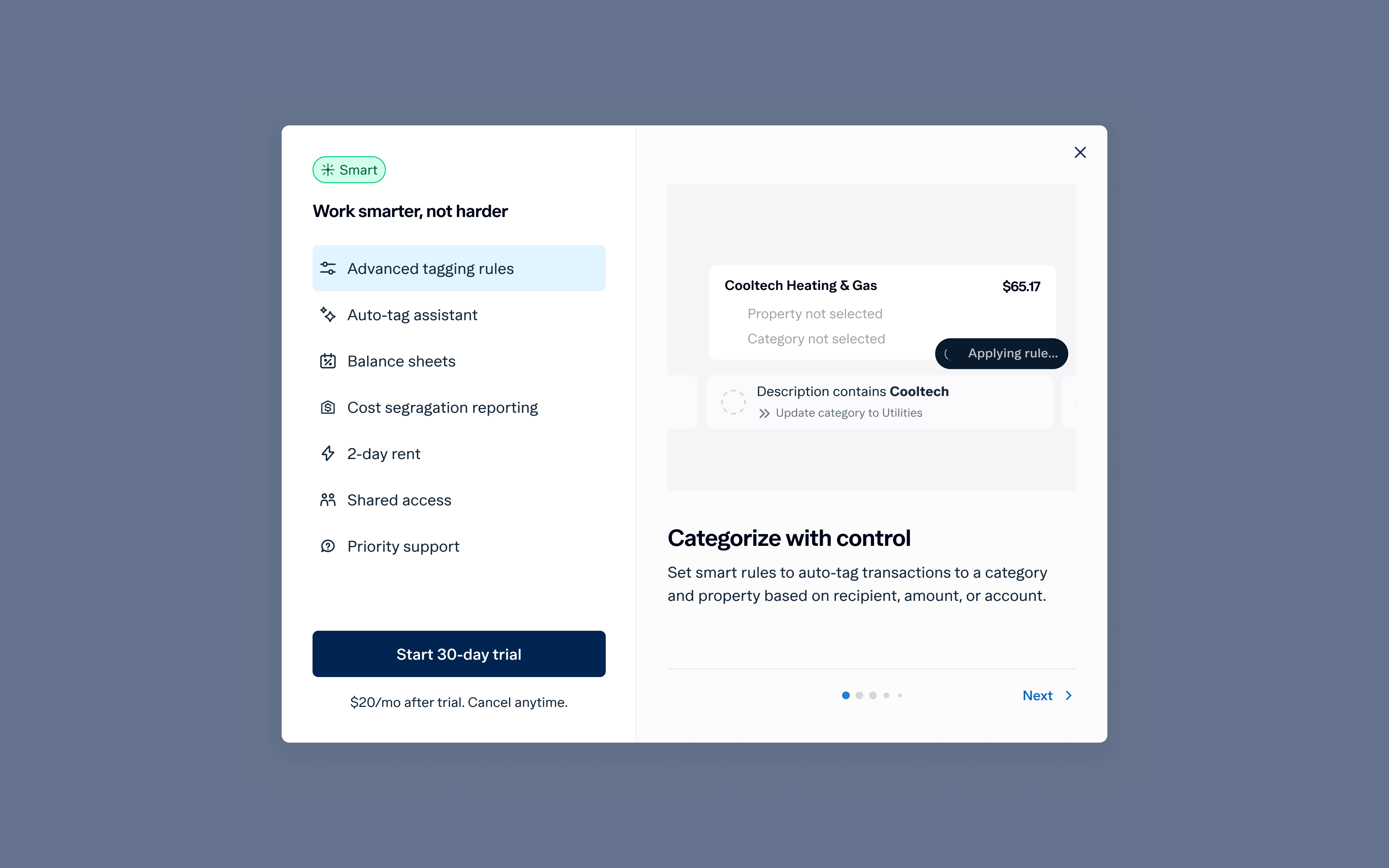
Core Upsell UX: Benefits-Based Over Plan Comparison
The first design question was structural: show a feature-by-feature plan comparison, or lead with outcomes? We explored both.
The plan comparison approach ran into an immediate problem: free users felt the free tier was good enough. Without a compelling reason to upgrade, the comparison table just validated their decision to stay put. We shifted to a benefits-based UI — foregrounding what Smart actually does for the user rather than listing feature names.


Upsell to New Customers
A key strategic decision: should we introduce the subscription pitch during onboarding? I mapped out several possible flows and stress-tested them with the product and growth teams.

Visibility & Staying Top of Mind
Once the trial was live, the challenge shifted to keeping Smart visible without being annoying. I designed three layered surfaces:


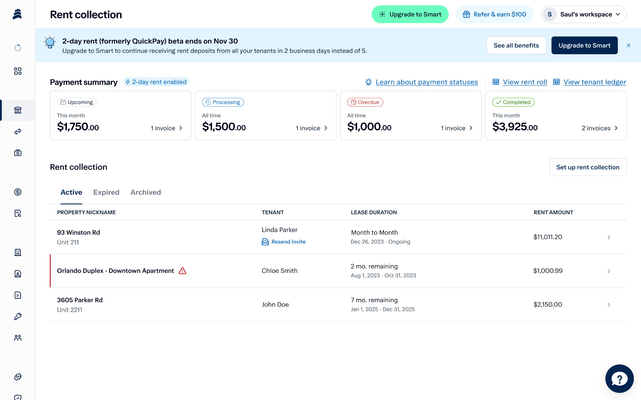
Transitioning Existing Users
The most delicate challenge: telling users who had been using certain features for free that those features would now require a paid plan. I worked closely with PM and engineering to understand the logic changes and user impact, then partnered with PMM on the communication strategy.


Branding
Baselane Smart needed its own visual and verbal identity — distinct enough to feel premium, cohesive enough to still feel like Baselane.
Logo & Visual Identity
Working with our graphic designer, we developed two distinct logo directions for Baselane Smart.


Animations
Smart needed motion to feel alive on the upgrade screen. After iterations with our in-house designer and several freelancers, we returned to our existing agency with me leading creative direction.


Building the New Features
Baselane Smart launched with a focused set of automation-first features. I worked with different PMs depending on the feature area.
Automated Bookkeeping
I designed a guided setup experience that walked users through their bookkeeping configuration, with automations revealed progressively. We validated the UX with our ambassador group before broader release.


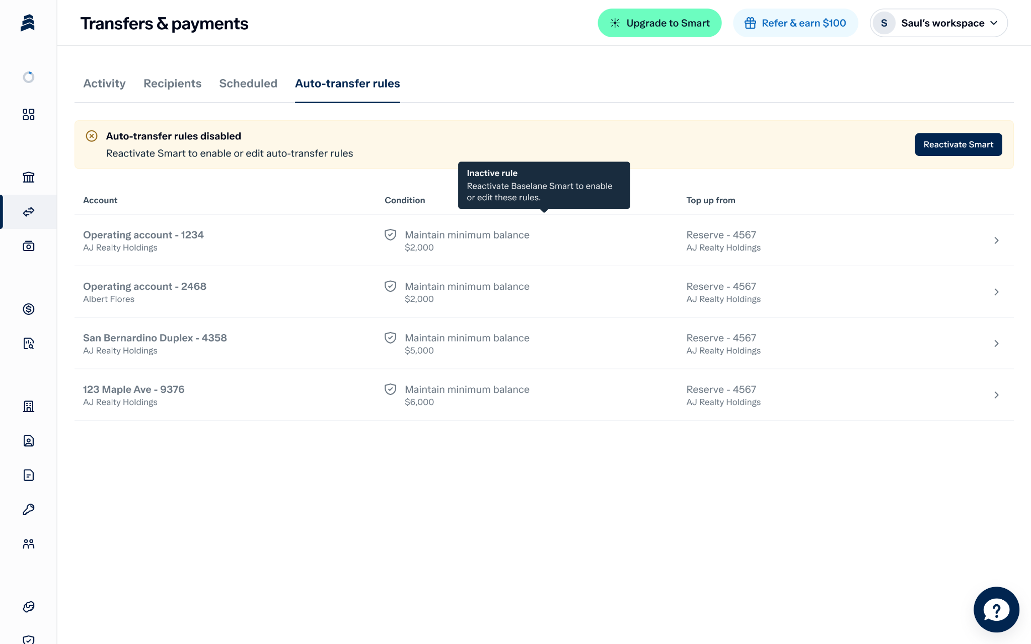
Auto-Receipt Matching & Minimum Balance Transfers
These features focused on clarity and placement of feature hooks — contextual prompts that encourage free users to upgrade at the right moment.


SaaS Essentials
A subscription product lives or dies on the quality of its billing and account management flows. These are often underestimated in design effort — but they're where trust is built or lost.
Free Trial + Payment Setup Flow
I worked closely with a backend engineer to design the payment setup flow, requiring deep familiarity with how Chargebee handles trial states, payment methods, and subscription lifecycle events.


Billing Management & Downgrade / Reactivation
This included things like billing management which involved working with backend devs and understanding Chargebee's workflow. This also involved thinking about specific features post-downgrade, and we designed for transparency and nudging users to reactivate.
Wrap Up
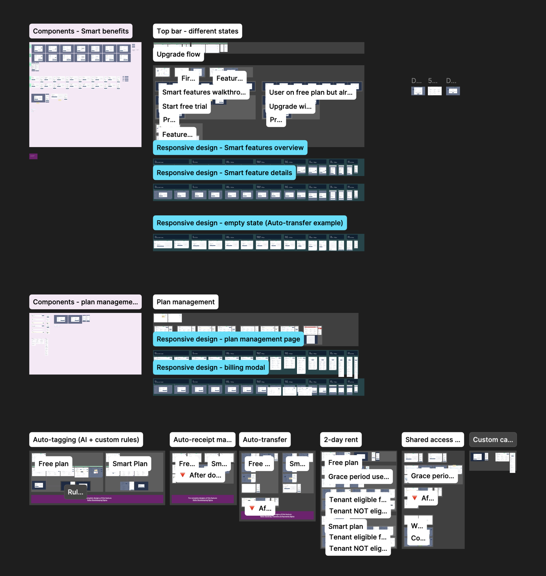
Once the core launch was shipped, I turned to consolidating the design foundation — Figma cleanup, updating feature-specific files, and abstracting new Smart-specific components into the shared design system.

What shipped, and what it delivered
Reflections
I spent a disproportionate amount of time iterating on the upsell modal. The version we shipped was very close to my initial direction. On a complex, multi-workstream project like this, knowing when to commit is as valuable a skill as knowing how to explore.
